
RETECHNOLOGY PREMIUM MARKETPLACE RELATED PRODUCTS | WEBINARS | SPECIAL OFFERS


You are viewing our site as a Broker, Switch Your View:
Agent | Broker Reset Filters to Default Back to List
Due to the ongoing situation with Covid-19, we are offering 3 months free on the agent monthly membership with coupon code: COVID-19A
UNLIMITED ACCESS
With an RE Technology membership you'll be able to view as many articles as you like, from any device that has a valid web browser.
Purchase AccountNOT INTERESTED?
RE Technology lets you freely read 5 pieces of content a Month. If you don't want to purchase an account then you'll be able to read new content again once next month rolls around. In the meantime feel free to continue looking around at what type of content we do publish, you'll be able sign up at any time if you later decide you want to be a member.
Browse the siteARE YOU ALREADY A MEMBER?
Sign into your accountAn App Isn't Enough to Make Your Business Mobile Friendly
November 17 2015
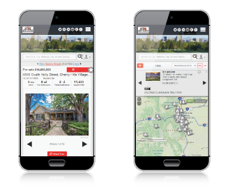 Is your business optimized to serve today's mobile consumer? If you offer buyers and sellers a property search app, but your website is difficult to use on mobile devices, you're missing out on a lot of potential leads.
There are several reasons for this. First, consumers are not using property apps exclusively. Many, especially those early in the search process, are still Googling "Mytown homes for sale." If their search brings them to your IDX site, how long will you think they'll stay before moving on to another site that's easier to use on their device? A few seconds, at best.
That's if they're able to find your site at all. In April, Google updated their search algorithm to favor sites that are mobile friendly. Termed "Mobilegeddon" by some, the update relegates sites that don't display correctly on mobile devices to the bottom of search results.
What Makes a Website Mobile Friendly?
So what is it that makes a site work well on mobile. In days past, some websites would actually offer two different versions of their content--one designed for specifically for mobile and a "full" site that works on desktop or laptop computers.
Today, "responsive" design has solved the need to build two sites. A website designed responsively can identify the size of the screen it's being viewed on and scale accordingly. This means that all devices and screen sizes--computer, tablet, and phone--can view the same version of a website.