
RETECHNOLOGY PREMIUM MARKETPLACE RELATED PRODUCTS | WEBINARS | SPECIAL OFFERS


You are viewing our site as a Broker, Switch Your View:
Agent | Broker Reset Filters to Default Back to ListHow To Easily Plot and Map Multiple Locations
July 22 2014
Map out your home sales and embed them on your WordPress real estate site!
 A new add-on for Google sheets – part of the Google Docs online service, now enables mapping from spreadsheets. The Mapping Sheets add-on provides an almost ridiculously easy way to plot your data onto a Google Map directly from Google Sheets.
This is cool because you can now do something like this in under an hour. Just follow along with the tutorial on the next page.
Check out Peter Toner's home sales:
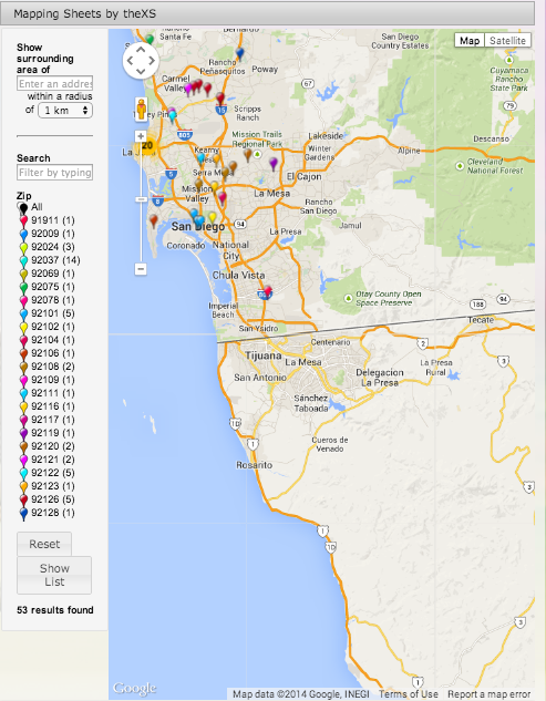 These are just some of the sales I actually did personally the past few years.
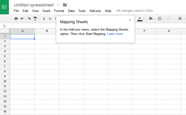
Begin by installing the App. Once installed, click on Add-ons/Mapping Sheets/Start Mapping.
When Mapping Sheets is active, a new box appears on the right of the page:
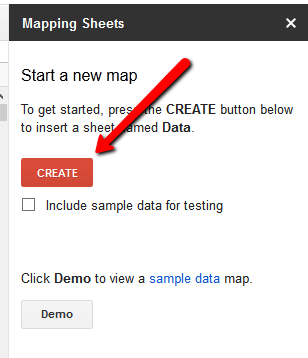
- Click Create to get started. A new sheet will appear. To add data, I cut and pasted sold listings from my MLS, using a CSV file that was downloaded and opened in Excel.
- Map the field headings. Click Build and the "Select column headers for mapping" will populate so they can be selected.
Clicking on Build again will map all the addresses in the address column. I had to add the zip code to the address field as Google only recognized two-thirds of the addresses as being in San Diego.
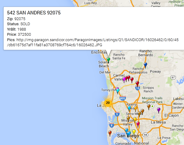
Once that's done, in just about 30 seconds for my sample, you can click "view" – and up will pop your map in a new window! If you add or include other columns, they will show up when you click a marker like this:
You can also change the order of the field display by dragging columns in the sheet. The clustering works nicely, too. If there are too many pins close together, it displays a number.
The field that you choose for "Filter" will be the one that the map uses. In my case, individual zip codes can be filtered in and out on the map. You might choose something else as a filter. Year sold, number off bedrooms, etc. If you had sold, active, and pending in the same column, you could filter against that, too.
To get it on the page select this code below, replace the placeholder address with the URL from the map and adjust the iFrame width and height as required for your map and page.
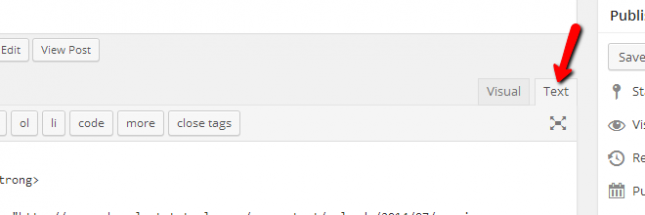
Paste it in as text, though, or the map won't show up.
![]()