
RETECHNOLOGY PREMIUM MARKETPLACE RELATED PRODUCTS | WEBINARS | SPECIAL OFFERS


You are viewing our site as a Broker, Switch Your View:
Agent | Broker Reset Filters to Default Back to ListiOS7 Is About to Get a Little Less Flat
February 02 2014
If you're an iOS7 user, you've noticed something very different from the previous look and feel of iOS: gone are the icons and apps that looked like their "real-world" counterparts. The Notes app no longer looks like a pad of paper; Newsstand doesn't simulate wood shelves on which to "hold" virtual books; Game Center ditched the green felt of casino gaming tables. Skeuomorphism is out, and flatness is in. (See Apple's redesigned icons here, and many more examples here.)
"Flatness" isn't just something that is now part of iOS7's aesthetics. Flatness can also be thought of as the reduction or elimination of affordances. And this directly affects usability, which is why I (as a user experience designer) am interested in it.
What's an affordance?
An affordance is "a property of an object...which allows an individual to perform an action." In the real world, a good doorknob says "Twist me!" In the world of computer and phone applications, buttons and labels have traditionally broadcast to us how to interact with the screen. But as iOS has grown up, some of those affordances have been removed, and the interaction design has been flattened.
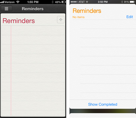
Above (left) is the Reminder app from iOS6; it's pretty clear that tapping the + icon is the way to enter a new reminder. On the right is what Reminders looks like in iOS7; where would you tap to add a reminder? (HINT: "Edit" isn't what you're looking for.)
The answer is "virtually anywhere on the screen." It might not take that long to figure it out, especially if you have previous experience using a touch-based device. But it is rather odd that something that works so well and is so universally understood — the + sign — has been removed, and I don't think it's very intuitive for those buying their first iOS devices.
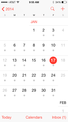
iOS7?s flat design has also removed buttons, leaving behind the labels that used to sit on top of them. Below is the current Calendar app; note there's not a button to be seen anywhere, and there's no visual distinction between what's simply a text label and what is text that can be tapped.
The forthcoming iOS7.1 will allow users to turn on "Button Shapes," which will make text that functions as a button look more like, well, a button. You can see a preview of Button Shapes at Isobar's blog and at Business Insider, or search for "iOS7 button shapes" for many more articles.
Apple's commitment to flat visual design seems resolute, but putting the power of more visible affordances in the hands of the user is a very smart move.
To view the original article, visit the Bits and Bytes blog.