You are viewing our site as a Broker, Switch Your View:
Agent | Broker Reset Filters to Default Back to ListThe Power of a Great Logo
May 08 2015
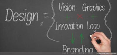 Everyone recognizes Nike's swoosh or Apple's bitten fruit icon. More than that, consumers associate those logos with a certain level of quality in the product or service they'll get from those brands.
That kind of recognition can be reached for your real estate brand, too. Here's how three brokers have built visual memory in their markets with branding that summons an instant, positive impression from potential clients.
Techies Before It Was Cool
 It's the simple and descriptive at sign that distinguishes Chicago real estate company @properties from its competitors.
"The logo has exceeded our expectations. It almost feels interactive," says Thad Wong, @properties co-founder and partner.
Back in 2000, when the company's logo was first developed, there was not yet sharing of data in real estate, and there was a fear of losing control, Wong explained. "Not only did we embrace technology, we were technology — and our logo stated that," he said.
But the logo actually felt foreign to Wong and his partner, Michael Golden, in the beginning. "At first, the at sign was intimidating," Wong says. Their impression of it changed the more they used it. Now it's comfortable, says Wong, and the logo has evolved into fresh, interconnected marketing campaigns. The company's newest: "Love where you are @."
"We hope that any time [consumers] see the at symbol, they think of us," Wong says. "We attached to the technology movement and put that technology into the name instead of our egos."
Transforming Business With Beachy Logo
 Karen Smith, broker-owner of Beachy Beach Real Estate in Panama City, Fla., puts her logo on everything from lip balm and nail files to bandanas and bars of soap. She's convinced the simple hut-and-palm tree logo has helped her business grow in a short time.
After buying the company four years ago, Smith says, she took the logo and applied it in new ways. For instance, her company sponsors many community events, such as the upcoming Pepsi Gulf Coast Jam in September. More than 28,000 people are expected to attend, and Smith has ordered 10,000 can koozies with her hut logo printed on them.
"We really have gone bat crazy with our logo. If we can stick it on something, we do it," she says. Her company also sponsors the Seaside Half-Marathon, where it gives out items like shoelaces and running socks.
 Smith adds to that fun by dressing up the beach hut logo on special holidays. For instance, on Veteran's Day, the hut goes patriotic with stripes and stars. On Halloween, it becomes a "friendly" orange haunted house with a bat and a ghost.
Her branding effort has paid off. The company went from three to 40 agents and added five office locations in four years. "You can't help but smile when you say 'Beachy Beach.' The name is synonymous with being happy," she says. "No one knew who we were when we started out with three people. But we started putting the logo everywhere. Everybody recognizes us now."
A Bicycle Bonanza
 When Tim Shea took over Pedal to Properties in Boulder, Colo., almost three years ago, he did something that instantly put his company's bicycle logo in a niche spotlight.
"From a marketing standpoint, it's the low-hanging fruit," he says. "We sponsor bike events."
The cycling community in Boulder is huge, with a plethora of bike races and family-oriented bike rides. Rather than traditional advertising, Pedal to Properties is using marketing dollars to sponsor many of those cycling events, which is getting its logo seen by hundreds of bikers and spectators. And twice a year, the business organizes a Bike to Work Day — one in the winter and one in the summer.
"We set up a tent in front of our office, and we serve hot chocolate in the winter and breakfast in the summer. We try to put ourselves in front of the bicycling enthusiasts that might be drawn to the brand," Shea says.
He characterizes Boulder's real estate market as vibrant, with prices trending upwards. Many people are relocating from California and New York, bringing with them a bit of money and a vision for a healthier lifestyle. Shea believes his logo speaks to that buyer by communicating a sense of professionalism coupled with fun and lightheartedness.
Shea has leveraged the whole idea of bikes and real estate in another way: He has placed about 50 community bicycles throughout town — at local hotels and in front of his office, among other locations — so that visitors and passersby can use the bikes simply by signing them out.
"It gives us a little bit of brand recognition," he says. "Plus, people think it's pretty cool."
To view the original article, visit REALTOR®Mag.

