The Writings on the Web: Fun with Format
February 28 2011
 If you have all been paying close attention to the "Writings on the Web" series (you have, right?), that means that you’ve read this last post.
Now that you’ve had some time to think about the words on your website, it is also important to think about the general format in which you will place your words.
Layout
- Not only should what you write be easy to follow, well punctuated, and to-the-point, but it should also be laid out in a presentable format. Avoid placing paragraphs all over your website in random places – keep it organized in such a way that feels natural to read.
- While keeping the above in mind, also think about following the “F” Rule. Did you know that most readers typically view website content in the shape of the letter “F”? It’s one of those involuntary habits that you don’t realize – but if you think about it, you might notice that you do too. Here’s an image for an eyetracking study that was conducted back in 2006:
![]()
Not everyone will read a site this way, but it can be assumed that the majority will follow this type of pattern – knowing that, it is important to place your information in such a way that visitors will come away with the relevant information they need while skimming your site. In other words, it might not be the best choice to place your ‘call to action’ near the bottom of your website.
A few Do's and Don’ts:
- Do change the color of visited links. With the amount of information available on most pages it is very easy to get lost and go around in circles if the same color is used for both new as well as visited pages.
- Don’t use a ton of animated .gifs or emoticons…also known as ‘glitter graphics’. Scratch that – avoid these at all costs! Have you ever come across a website that’s covered in these? It’s hard on the eyes. Not only are they extremely out-dated, but they will detract attention from the message you are trying to convey to your visitors.
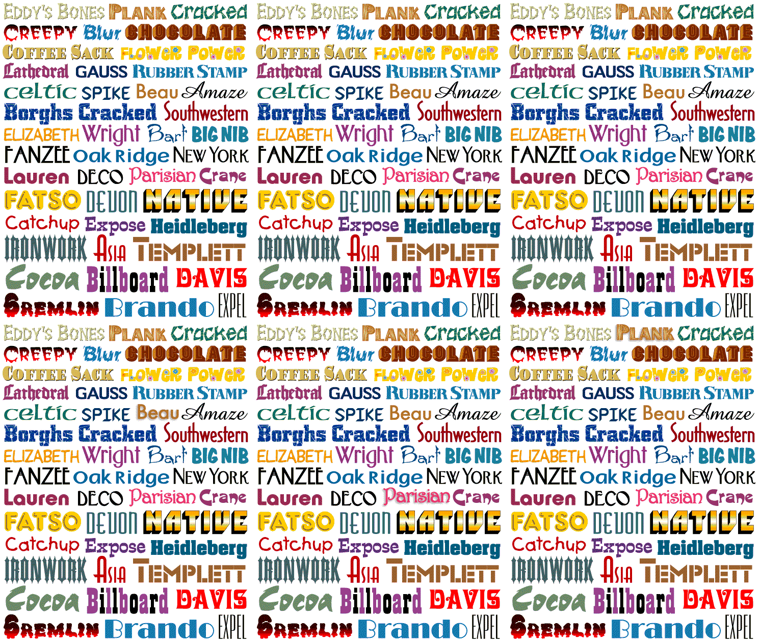
- Do use a font that is easily read and aesthetically pleasing to the eye. Most commonly used are fonts like Arial, Veranda, Helvetica, Georgia, Times New Roman, and so on. Steer clear of anything with curls and swirls. Find what works for you, but remember that most people won’t read if it’s not legible.
That’s it for today! And now to illustrate both of the points above, see the next page...
If you would like to learn more about Point2 Agent, please click here.


