
RETECHNOLOGY PREMIUM MARKETPLACE RELATED PRODUCTS | WEBINARS | SPECIAL OFFERS


You are viewing our site as an Agent, Switch Your View:
Agent | Broker Reset Filters to Default Back to List3 Guidelines to Assess Your Competitors’ Websites
October 31 2011
When you look at a competitor’s site, wouldn’t it be nice to be able to quickly assess how they “stack up” when compared to your website? By following a few guidelines, you can accomplish this and, more importantly, pinpoint areas you can improve – ensuring that your site rises above theirs.
1. What is their competition like?
To develop a real understanding of anything, it’s important to put it into context. Your competitors’ websites must be put into the context of their competitors (many of whom you will have in common). To get started, you can see how many sites – and which sites – have the same key phrase in the title.
- Visit Google.com.
- Search for : intitle:“main keyword phrase” (i.e. intitle:“real estate san francisco”).
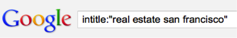
When I search for intitle:“real estate san francisco,” it returns 527,000 results. That means almost 530,000 webpages have that phrase in their page title. That’s a whole lotta web pages! I also see that the results, in addition to being quite numerous, generally have pretty good information. That makes for tough competition.
You may want to repeat your search with several different keyword phrases to see how everything measures up.
2. Functionality.
When it comes to website functionality, there are a great many things you should be looking for when you evaluate your competitor's website. A few of these include:
- Broken links
- Slow page loading
- Video players not working
- Broken images
To determine overall functionality, take the site for a “test drive” and play customer. Set up searches, register, save your searches, modify searches. You’ll know after navigating around for several minutes if there are any glaring problems.
3. Usability.
Even if a website doesn’t have any glaring problems, it isn’t necessarily a good user experience. The factors to consider here are endless:
- Can you read the text? (Consider font size, font type, font color, etc.)
- Are the company’s logo and contact information featured prominently? That logo should also link to the home page.
- Does the site include agent bios and an “About Us” section?
- Is the site search easy-to-use and effective?
- Is the site easy to navigate? Can you find a site map?
- Are there social media buttons that allow you to share content?
- Is the content clean, simple, and accurate? Watch out for grammar and spelling mistakes.
- Is there a contact form?
- Did you have to register before you could perform just a single property search?
- Test it on mobile phones – iPhone, Blackberry, Android, and iPad
These are just the beginning of the usability and functionality factors you should consider. What you’re looking for is a comprehensive view from 40,000 feet. If you can find areas where a competitor’s website is better than yours, those are the areas you should work on. Never stop working on making your website better.