RETECHNOLOGY PREMIUM MARKETPLACE RELATED PRODUCTS | WEBINARS | SPECIAL OFFERS


You are viewing our site as an Agent, Switch Your View:
Agent | Broker Reset Filters to Default Back to ListReal Estate Re-branding: What We Can Learn from 3 Top Brands
March 29 2018
Three lessons you can learn from the rebranding efforts of top real estate brands
Whether it's Century 21's bold new brand attitude or RE/MAX's refreshed logo and balloon, it's impossible to ignore that real estate is going through a major branding shift. While it's easy to simply shrug and move on as these new logos and brands are switched out (especially if you aren't a C21 or RE/MAX agent), you may want to stand up and take notice. The revised look and feel of a major brand can require years of research and design conversations... and millions of dollars spent on ad agency resources.
Here are three lessons you can learn from the "big guys" and leverage in your own branding.
Lesson 1: Choose a digital-first font
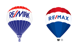 Perhaps you were so focused on RE/MAX's new balloon that you didn't notice a subtle shift in their new logo's typeface. While the all-caps red text and blue slash were both maintained in the new logo, you'll notice that the new logo's typography offers more space between each letter. Additionally, the overlapping elements (the slash and the "E", and the "A" and "X") are no more.
By selecting a font with increased spacing between letters — and one that no longer has the overlap in letters, RE/MAX has ensured that the logo can be shrunk to increasingly smaller sizes, including on mobile devices, without becoming illegible.
Agent lesson: If desired, you can maintain important brand consistencies even when creating an entirely new logo. Don't be afraid to keep what is working for you — whether it be colors, serif or sans-serif font or other elements (like RE/MAX's differently-colored slash). Do be sure that your logo is clear on any sized device and is legible even in a small mobile ad or sidebar ad on Facebook.
Agent exercise: Shrink your logo waaaaaay down and then view it on your mobile device. Can you read it? If no, then you may want to consider a new, mobile-first font or increase the spacing between your logo's typeface.
Lesson 2: Embrace all consumers
 Century 21's new design famously removes the house icon from its black and yellow logo. In addition to the logo being more modern and easier to use across various mediums, it's also meant to show that Century 21 agents can help with non-house transactions, including apartments and commercial spaces.
Agent lesson: Even if your branding has an element that seems inextricably tied to you (and therefore giving your brand strength), it could be turning off some potential consumers.
Agent exercise: Review your marketing pieces for icons of houses or even just the word "house." Consider that plenty of buyers may be looking for condos or apartments, and you don't want to focus on houses when your real brand promise is to help them find home.
Lesson 3: Leave room to grow
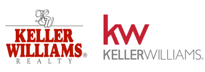 Keller Williams revamped their brand nearly five years ago, in 2013. The old Keller Williams logo was in such stark contrast to the newer version that it's hard to choose just one thing to point out in this article. But let's focus on how clean the new logo is, and how easily it allows for market centers, individual offices or specific agents to include the official KW logo alongside their own branding.
One complaint that agents and consumers share is that agents are tethered (for better or worse) to their broker or franchise brand. When the umbrella brand is so distinct that it cannot be "shared" easily with an agent, broker or office brand, you often end up with a mishmash of clashing logos, rather than one cohesive brand offering.
KW's logo isn't the only one to have fixed this branding issue. We would argue that both Century 21 and RE/MAX's new logos allow their agents, brokers, offices and markets to shine a little brighter.
Agent lesson: By condensing your creative down to highlight just one brand, you can offer a more cohesive look and feel across all marketing pieces and digital assets.
Agent lesson: Look at your "umbrella brand" and see if there is a way to merge your brand with theirs. Talk with your managing broker to see if they have any recommendations to marry the two brands.
To view the original article, visit the SmartZip blog.