
RETECHNOLOGY PREMIUM MARKETPLACE RELATED PRODUCTS | WEBINARS | SPECIAL OFFERS


You are viewing our site as an Agent, Switch Your View:
Agent | Broker Reset Filters to Default Back to ListShare This: Market-Driven Graphics Your Sphere Will Love
March 15 2018
Want to spruce up your website, blog, or social media profiles with sophisticated, market-driven imagery? Today, we'll show you how to take advantage of a resource that's free to you as a dues-paying REALTOR.
Take Advantage of High-End Market Visualizations
We all know NAR-affiliated realtor.com as a popular property search portal--but did you know that the site also has a Research section that's chock-full of interactive maps and charts that you can share with your clients and prospects?
It's true--and REALTORS are free to embed, download, and re-post these visualizations across their marketing channels!
Here's a sampling of the interactive reports realtor.com currently offers, and suggestions for how to use them in your marketing efforts:
Market Hotness Index
Is it better to buy or sell in your area right now? Turn to the Market Hotness Index to find out! The Index ranks metro areas, counties and zip codes according to demand and supply dynamics and displays this information in an interactive graphic format.
There are two reports in this section. The first, Hottest Real Estate Markets, shows how your metro area ranks nationally. The bottom section offers more detail, like its ranking month-over-month and year-over-year, as well as an interactive "Trend" graph that shows market activity for the prior three years.
The second report, Zip Code and County Hotness, offers a more granular look at your local market. For at-a-glance data on any area, simply hover your mouse over it:
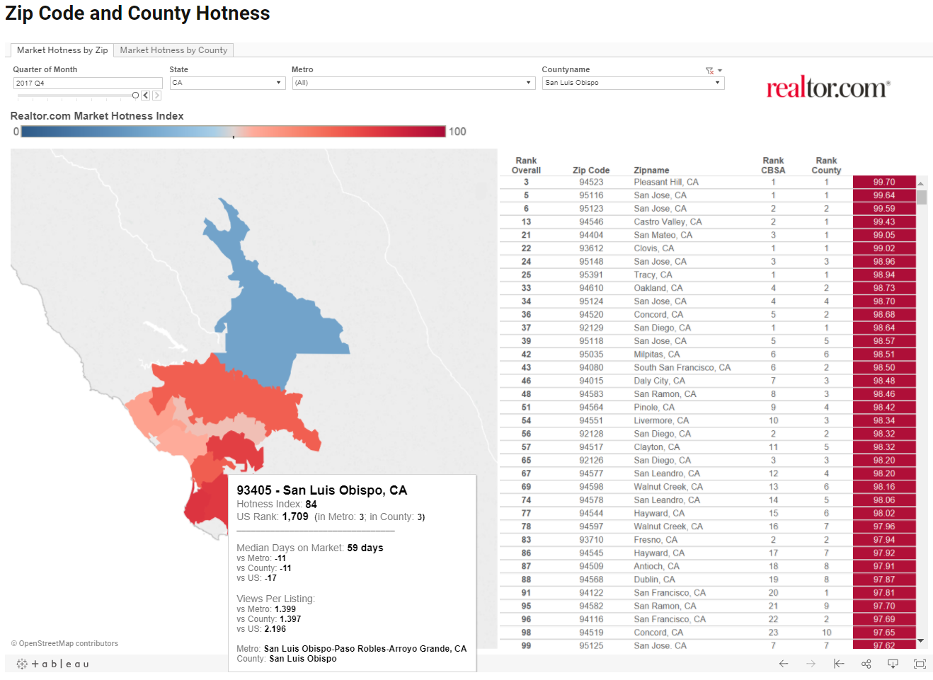
Use Market Hotness reports to illustrate blog posts and social media updates. The data it conveys can be your starting point for your post, but be sure to explain what the data means for your reader. For example, if the market is "hot" but is cooling compared to previous time periods, stress that now is the time to sell before property values decline.
Rent vs Buy Report
Are first-time buyers your preferred niche? Reel in prospective new buyers with the Rent vs Buy Report. This simple map displays where it is cheaper to buy and where it is cheaper to rent, broken down by county.
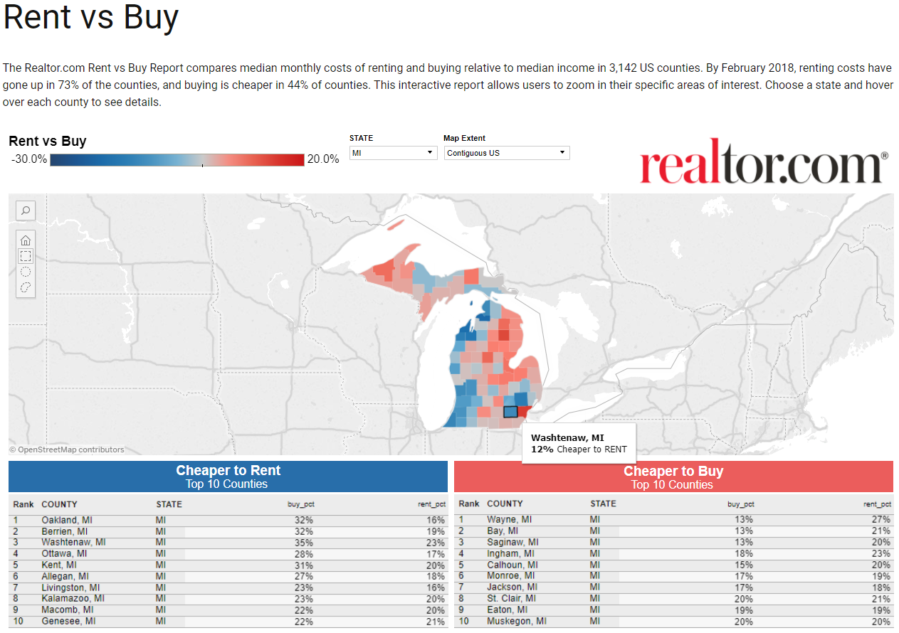
If your area is one where it's cheaper to buy, use this information to get would-be buyers who need a nudge off the fence. Bonus: this Rent vs. Buy calculator can help further nudge prospects along.
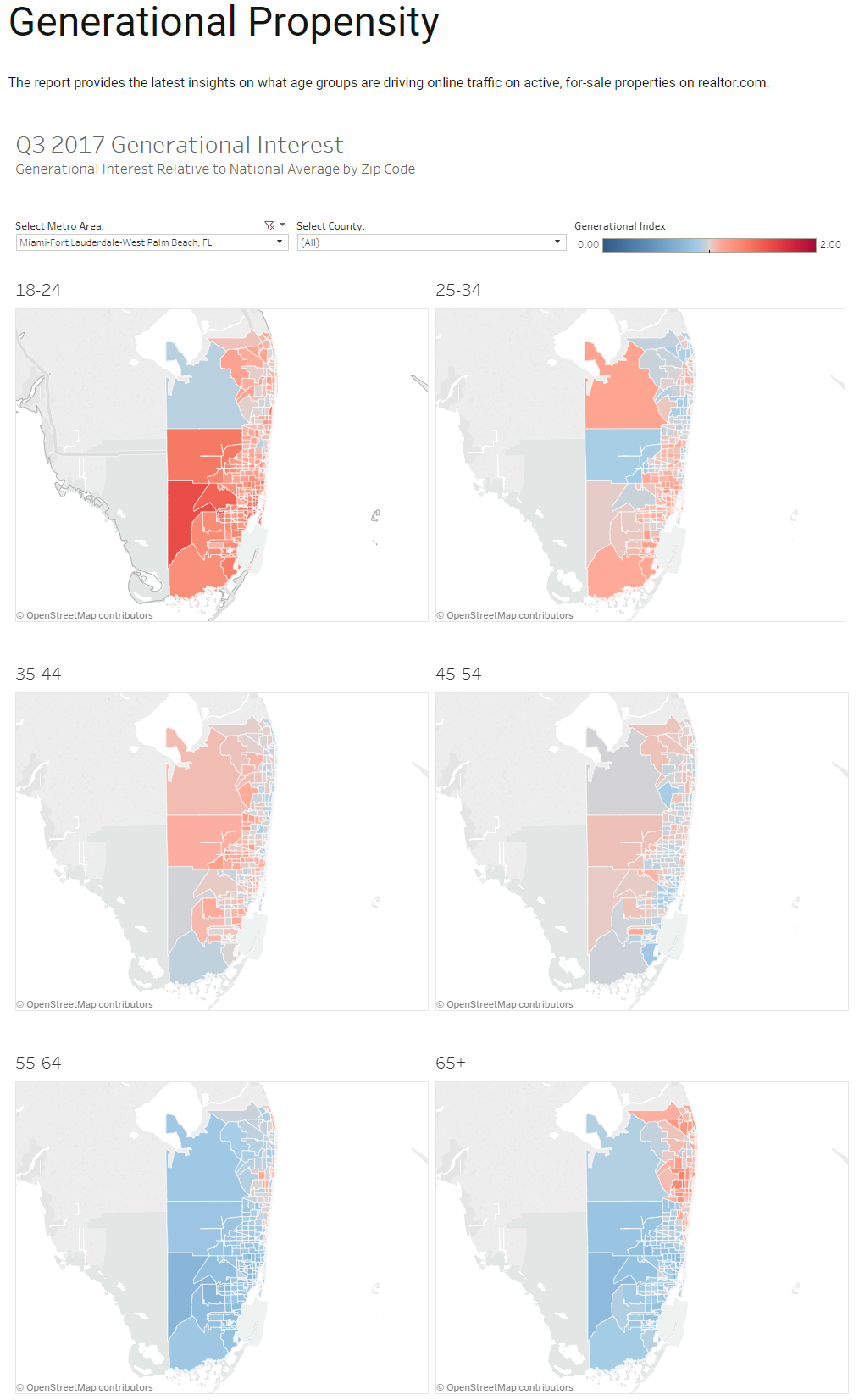
Generational Propensity Report
The Generational Propensity Report shows the interest each generation has in a particular zip code. Use it to talk about which neighborhoods are hot with young professionals or which are preferred by retirees. You can even center entire posts or articles around where members of a certain generation are heading, and how you can serve their particular needs.
Here's a sample of what one of the three available visualizations look like:
Cross-Market Demand Report
Where are potential buyers from? The Cross-Market Demand Report will show you from which locales out-of-area buyers hail. You can use this to help sellers understand where interest in their property may originate from, and which areas you should target in your marketing. This is viewable at both the national and state levels.
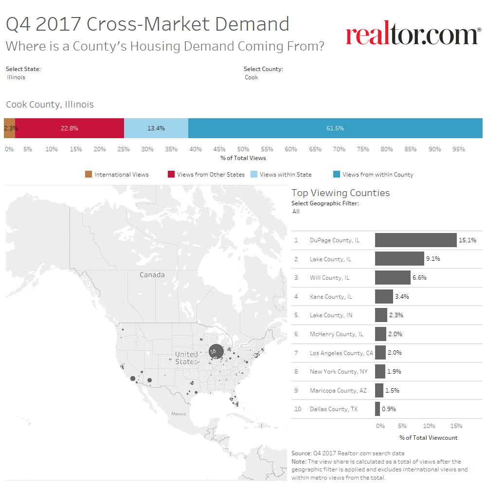
On the same token, you can use this data for your own personal research. Trying to figure out which audiences you should target with that Facebook ad for your listing? Look at this map and see where demand is coming from and then add that area as a target area for your Facebook ad audience.
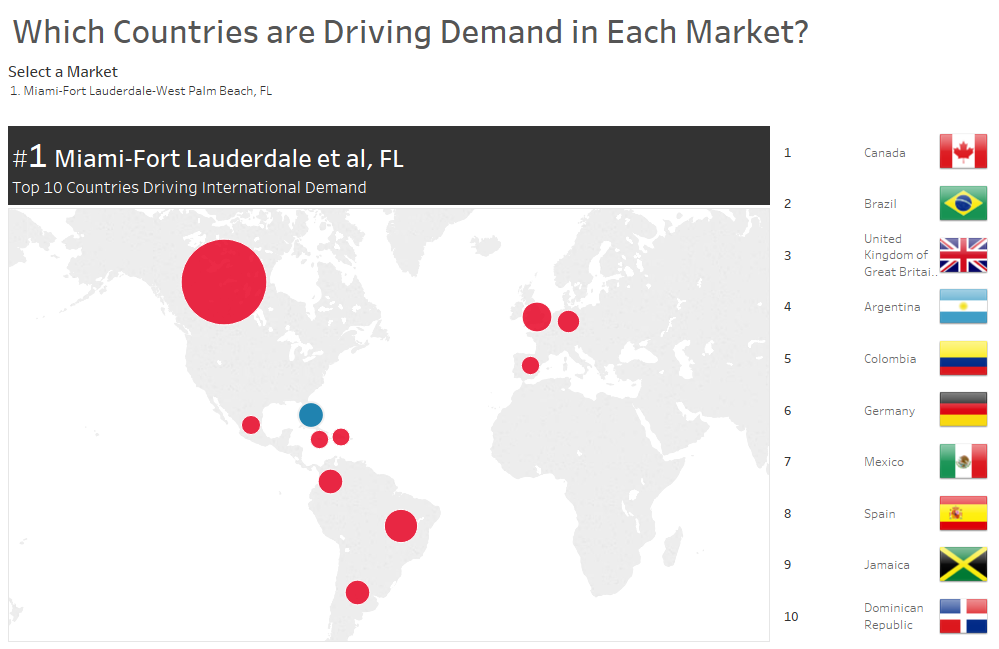
International Demand Report
Depending on where you live, in-state and in-country buyers may not be the only ones looking to move your area. Broaden your knowledge of where demand is coming from with the International Demand Report. This report offers multiple visualizations that detail from which countries listings in your area are getting attention.
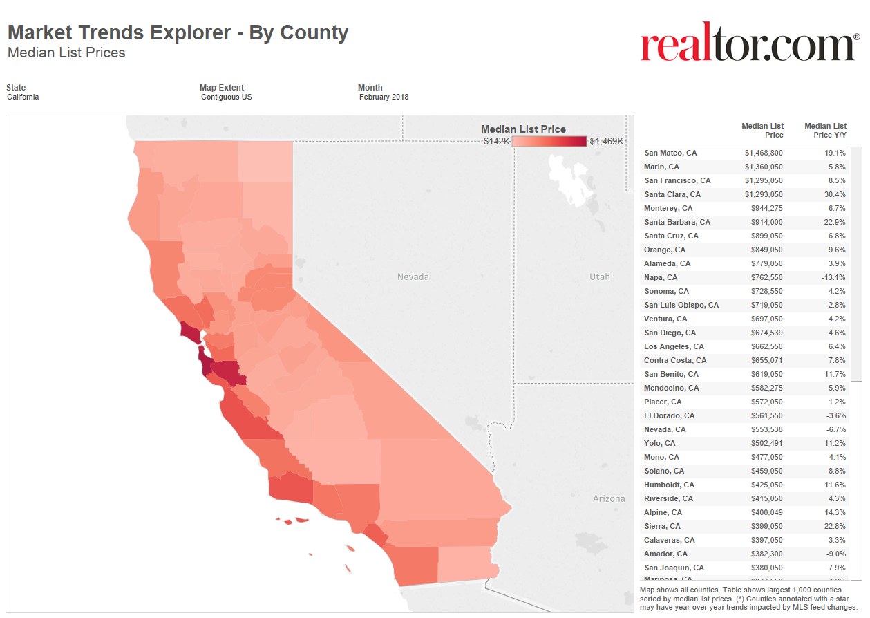
Local Market Trends
How's your area performing compared to last year? Find out with Local Market Trends visualizations. View heat maps and graphs on year-over-year trends in list prices and days on market. Share these with your sphere to help them grasp market movement in your area.
Sharing Market Stats from realtor.com®
So now that you're familiar with all the market-driven visualizations that are available to you, how can you share them with your audience?
The first step is to zoom in to your local area. By default, the maps display nationwide data; to focus in on your area, simply click on your area or select it from the drop-down list. Once you're zoomed in, you can share the visualizations by the following ways:
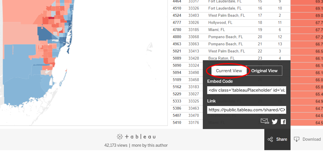
1. Embed a widget
You can share the fully interactive map by embedding it into your website. To do this, click "Share" at the bottom of the Tableau® visualization. You'll want to make sure you select "Current View" and not "Original View" (circled in image below) to ensure that you're sharing a map of your local market, not the entire U.S.
To embed, just copy and paste the embed code into whatever web page you'd like it to display on.
2. Share a link
Another way to share the full, interactive version of any visualization is simply to share a link to it. Like the "Embed" option, the linking option is accessible via the "Share" button. You can simply copy and paste the link to share it anywhere, or you can click the icons just below the link box to quickly share via email, Twitter, or Facebook.
3. Share as an image
You can also share realtor.com® market statistics as a static image. This is a good option for sharing on social media when you'd prefer not to link out to the visualizations. Although you lose the interactivity, the images can be incorporated into marketing assets, reports, blog posts, emails, and more.
To generate an image for sharing, click the "Download" icon. Next, select "Image," and you will then be prompted to download the image to your computer.
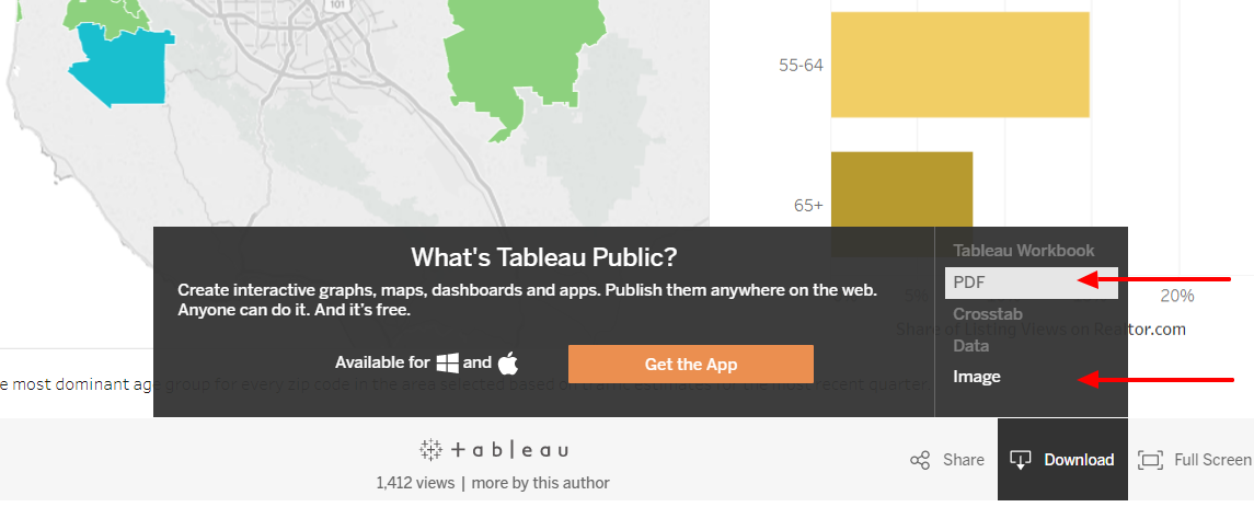
4. Share as a PDF
PDF is the final sharing option, and this is accessible via the "Download" icon as well. Simply select the "PDF" option to generate a PDF that you can download to your hard drive. PDFs are an excellent option for when you want to incorporate realtor.com® market statistics into more formal assets like reports.
Learn More
This was a simple overview of methods for sharing realtor.com® market statistics. For more in-depth instructions, click here. To see all market visualizations from realtor.com®, visit research.realtor.com.
Happy sharing!