RETECHNOLOGY PREMIUM MARKETPLACE RELATED PRODUCTS | WEBINARS | SPECIAL OFFERS


You are viewing our site as a Broker, Switch Your View:
Agent | Broker Reset Filters to Default Back to ListReal Estate Iconography
May 03 2017
When it comes to crafting a strong brand for a real estate company, never underestimate the power of being able to express a name without directly spelling it out. And there's no better way to do this than with iconography.
I've already discussed how much I love typography here. Its power is in its subtlety, as it gives form to your voice and shapes your brand. And it's a popular tool. Take a look at logos from some of the biggest real estate brands in the world:
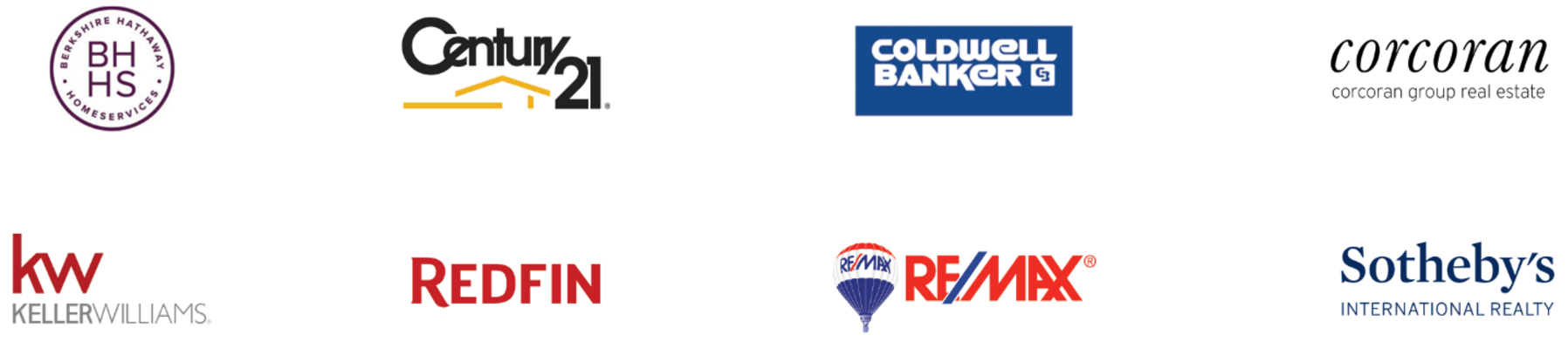
They all use typography as the dominant element forming their logos, and almost all of them exclusively use text. Century 21 is the only one here that references the shape of a house. In real estate, names give you strength and make these logos iconic.
Icons are less subtle. The beauty in them is a bit more apparent, in that a singular icon has the ability to express many words, even sentences, at times. At TRIBUS, we've championed a strong icon in our logo (along with typography that we developed extensively), which you can read all about here. Zillow is another real estate company featuring a prominent icon in their logo. Nike and Apple serve as some of the best examples outside the industry.
Iconography in practice
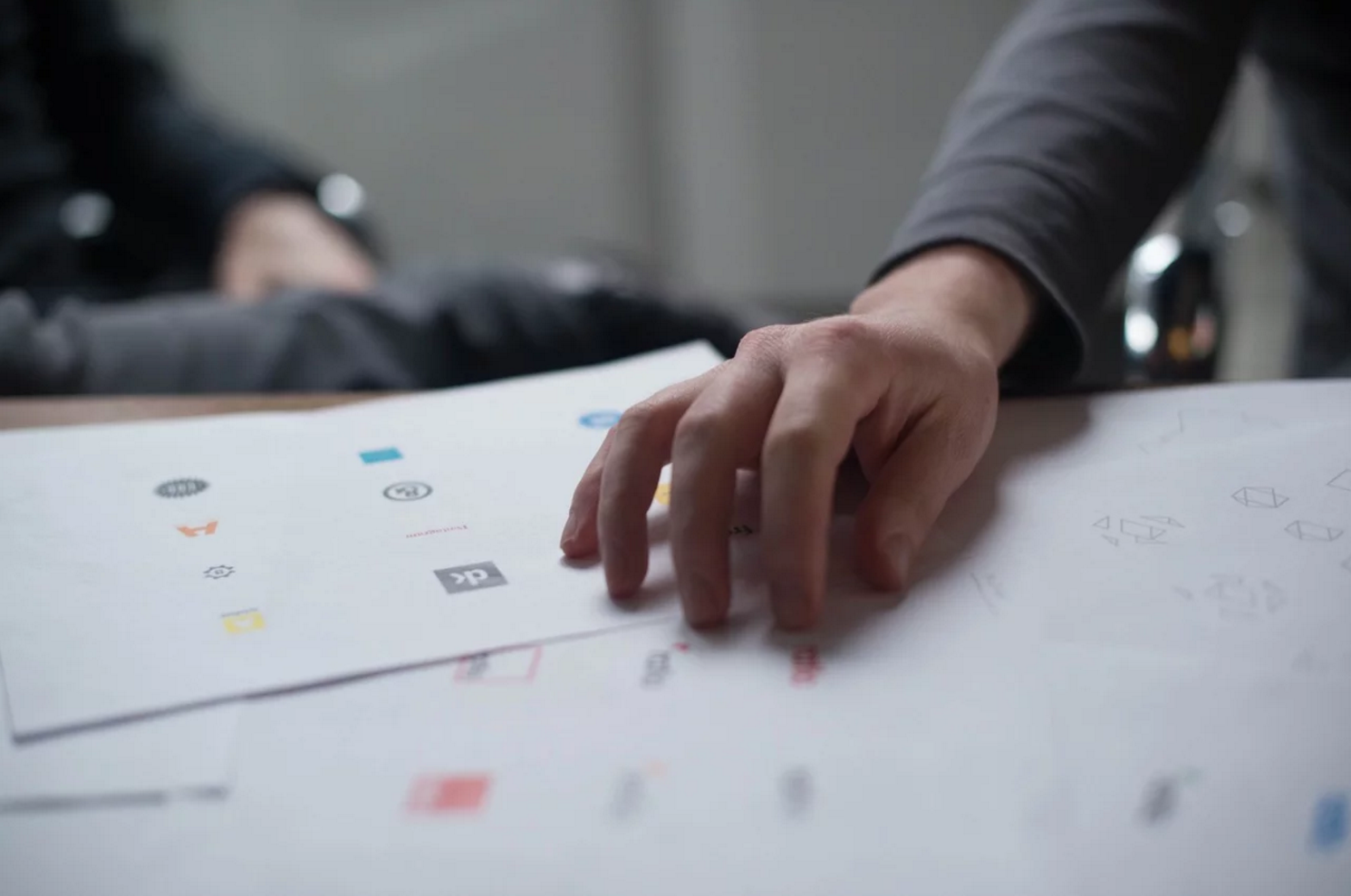
Based on the real estate logos I've presented, you might think it is really difficult to represent the industry in icon form. That couldn't be further from the truth, as we've really embraced iconography in our own brand, by crafting sets of them to represent our product and feature suite. Here is just a sample of some of the 80-plus icons we've made (click the image to view full-size):

Now, how many of these icons could you have recognized without the names underneath them? It might only be a handful, because associating a product word with a symbolic line drawing is difficult. But this method essentially aligns with our mission: Make platforms brokers, clients, agents and staff have never used before, making their jobs easier. And hopefully, over time, you will associate these icons with the services you'll come to use and appreciate.
An icon can last forever
Take, for example, the action of saving something on your computer. We all do it, whether it be in our personal or professional lives, and we've been doing it for quite a long time. So long, in fact, that floppy disks were the standard method of saving a file. Nowadays, it's laughable to think you would save precious files anywhere other than the cloud or your hard drive. We've changed so much.
But the icon has not.
There's a rather large debate in design communities over whether this particular icon is appropriate or not. Some may say nobody remembers or identifies with the floppy disk anymore, and the time is now to change it. We just don't see it anymore. On the other hand, I would challenge you to look around and see how many gears you see around you, or how many levers and switches — yet these are still the iconic objects we associate with computer settings. Additionally, how many actual tangible folders do you use on a daily basis? Should we then ditch gears, switches, and folders?
Those are pretty difficult images to replace, and I'd put the floppy disk in that group — for now. And that's not because I'm old-fashioned; icons don't need to be modern, they need to be relatable. Nothing more, nothing less. And because most people still associate a floppy disk with saving, then the metaphor behind the icon holds. If we just changed things for the sake of changing them, we risk the new icon becoming un-relatable. This is a common mentality among new designers: They always want to make the newest, greatest design, when in reality, they're trying to change the way people think. And that's a long and arduous process. Should we change the happiness icon from a smiling face to a taco? Because everyone loves tacos, right? In fact, let's change the love icon to a larger taco! Who hates tacos?
In the case of the save icon, it may take decades to change it. Many people still acknowledge that a floppy disk indicates saving, rather than actually using the disk—which is perfectly acceptable as long as people can relate.
The design department at TRIBUS, along with everyone here, is trying to push the boundaries of tech in real estate. We are looking at the form and function of the features and products we offer, and while we want to educate customers on what each product product actually does, we also want to discuss the words and images associated with it. That will be the way people will wind up remembering it.
The hope is that, when things go well, we've developed a language around our suite that will help our users translate meaning quickly and effectively whenever they interact with all things TRIBUS, like looking at a Nike Swoosh and thinking of shoes. And we bring that same sense of boundary-pushing — yet relatable — expertise to work for our clients.
To view the original article, visit the Tribus blog.