
RETECHNOLOGY PREMIUM MARKETPLACE RELATED PRODUCTS | WEBINARS | SPECIAL OFFERS


You are viewing our site as a Broker, Switch Your View:
Agent | Broker Reset Filters to Default Back to ListHome Search on Mobile Devices Continues to Grow
May 09 2016
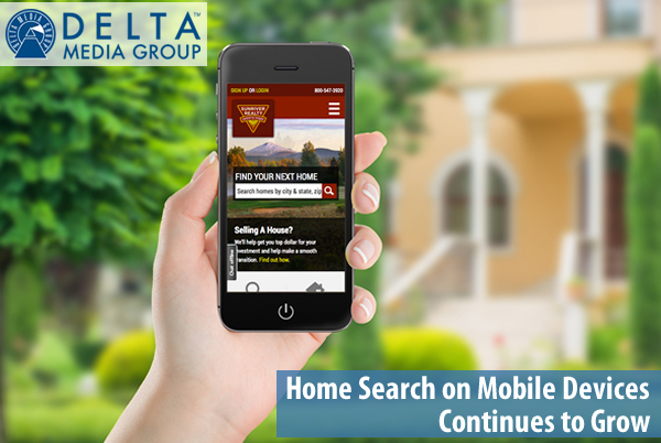 Summer is prime house hunting season—I'm not telling you something you don't already know. Google confirmed it when they reported that July is the month where real estate-related search terms typically spike. Combine that with the fact that 89 percent of home shoppers use mobile devices to search for homes, and I have to ask... Will your company be ready to capitalize on the 2016 selling season?
Let's face it—using mobile devices to search the web has become a part of our everyday lives. There's no doubt that a well-designed website that takes mobile into account is crucial in reaching today's real estate customers, but you probably have some questions about how and why it is important.
For many, the choice comes down to designing a "mobile first" website or living with what they have for the time being. Living with what is already in place may mean an app or app-like interface for mobile users. It could even mean living with a version of a website that doesn't render properly—typically frustrating and driving away potential customers.
This decision ultimately comes down to how your organization wants to engage its mobile traffic or if they are even ready to do so. This needs to be on the radar of every business owner as mobile usage continues to grow and becomes an even greater percentage of total website traffic.
With a mobile first website design, a visitor's mobile experience is the top priority in the structure and design of a site. The development process begins with designing a mobile site and then is designed to scale up to desktop size. That may seem like a small distinction, but it's actually a big deal. Design conventions for mobile sites focus on efficiency, simplicity, navigation, and ease of use on small screens; it ensures that SEO and usability best practices are followed. Finally, since the desktop and mobile versions are all the same site, mobile users will experience the same calls to action and conversion points as they would on desktop.
Put Mobile First to Reach Customers on Their Terms
Mobile design also requires considering the customer's journey. In other words, how does a customer go from learning about your business to actually taking an action? Most modern consumers do research, read reviews, and visit social media sites before taking the next step in the home buying process. Your mobile design should incorporate each step of that journey in a way that fits the goals of your business. Basically, you want to make it easy for your customer to learn more through their preferred channels in addition to the content on your website.
As the percentage of home buyers--Millennials especially—using mobile devices to buy a home continues to grow, the importance of a mobile first design will only grow in the coming years.
Add it all up, and you can see why having a mobile first design has quickly become the way of the future for the 2016 home buying season and beyond.
To view the original article, visit the Delta Media Group blog.