
RETECHNOLOGY PREMIUM MARKETPLACE RELATED PRODUCTS | WEBINARS | SPECIAL OFFERS


You are viewing our site as an Agent, Switch Your View:
Agent | Broker Reset Filters to Default Back to ListREALTOR.com Goes iPad – Consumer Experience
May 10 2011
The new REALTOR.com® iPad app launches officially at 6:35am EDT on April 26, 2011. You can read the full press release here and download it from REALTOR.com® now. With over 15 million people using iPads they can now start their home searches on REALTOR.com®. I have been testing it for a few days (gotta love a good embargo). The REALTOR.com® mobile apps have seen a 79% increase in usage over the last 4 months alone, serving the Android, iPhone, Windows 7, Blackberry and now the iPad markets.
This is the first of two posts on my thoughts on the app. This first one is the post from the consumer perspective. I am still digesting it from another perspective.
I love a shiny new toy, and when I was asked if I would be interested in testing a new iPad app for REALTOR.com®, I jumped on it! I know, I know… I am a fan girl of REALTOR® and Move; what can I tell you? But that was a hard-won battle on their part. Just ask my old sales rep. I used to beat the crud out of him. It took them 5 years to woo me back. I wouldn’t give up my REALTOR.com® upgrades for anything.
So late last week I got this fantastic shiny new toy – the REALTOR.com® mobile app for the iPad. So what, you say? Heck yes, I say!
I use the REALTOR.com® mobile app on my Droid often, and I used it on my Blackberry before that. Albeit far more useful on the Droid, because I can use the touch screen features, but on the iPad… talk about shimmy and shake! WOW! Today I joined a press release webinar to preview the app and some of the neat features. I think it is pretty darn hot, actually.
There are two ways to look at the new app; from the consumer perspective or the agent perspective. My thoughts are still evolving from the agent perspective as I can see that it could weaken the perceived value, even further, of the agent in the marketplace. That is saved for the second post. This one is all about the “shimmy and shake.”
Let’s make it a story, shall we? Jack and Jill want to buy a house. They are new to town, have an agent, and are driving around with their new iPad one day to explore homes. Jill uses REALTOR.com® all the time at home and discovers their iPhone app is now available on her new iPad 2. Jill downloads it from iTunes and jumps in the car. Jill logs into her REALTOR.com® account. As Jack drives (because, of course, the driver would never be looking at mobile device, as we were reminded during the press webinar today), Jill pushes the “Homes for Sale Button,” which opens the astonishingly cool map view. Blue pins everywhere!
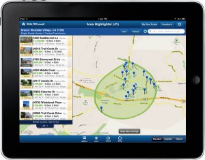 Jill smiles with delight as she realizes she can see any property that is displaying an address on the Internet. (Agents, take note. Opt in time!) Not only the address, but she clicks on the pin and the address, price, beds/baths pops up with an option to expand for more information. She clicks on the “draw” option and draws a very particular triangle in the area of town she knows works best for both of their commutes. Properties only appear in that triangle Jill specified and nowhere else.
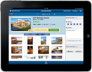
The Details Are in the Details
The details page is powerful. The layout is slick, simple, and uncluttered. Something that at times I don’t think the REALTOR.com® site is. (Disclosure: I am a usability/GUI development specialist. My past career included that.) It gets too cluttered feeling and the layout isn’t as intuitive as on the iPad. The beauty of the iPad search is the simplicity of the information share.
Graphic Designer Interlude: Aesthetically they got darn close to perfection. But if I were going to be completely frank, I would have gone with a different color palette, but no one asked me (someone should once in a while). The key with usability is to make the application, site or program as simple and intuitive as possible. If there is too much going on on a screen or page, the eye can’t handle it and moves on. There is a reason that often times the simplest lines in architecture are the ones that people like the most. Minimalism is appealing for a reason. But back to Jack and Jill as they drive down a hill.
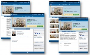
The details section includes a property overview. This includes a pop-up map and driving directions. Additionally, you have the full details tab and – my favorite – the photo tab.
Pictures, Pictures and More Pictures!
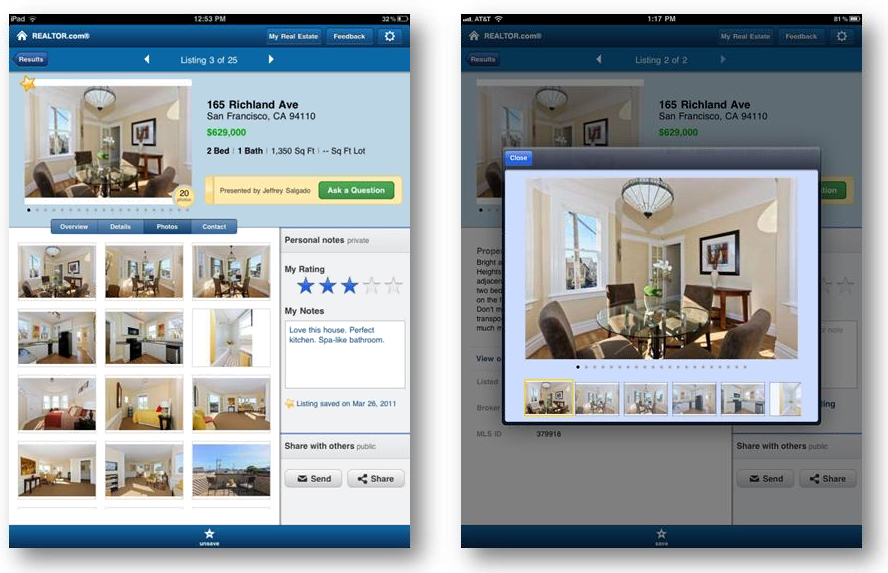 Pictures sell houses. Jill wants to see the house. If they don’t have the full 25 photos, they must be hiding something (basic psychology, people. Are you failing the first test of the ready, willing and able buyer?) She won’t even consider it. She clicks on a listing, and the photo viewer pops up. Scrolling display helps her navigate through the listing photos. Since they are stopped for coffee, she shows Jack the listing. Jack and Jill decide to drive by the house to see if they like the neighborhood. It is just around the corner, after all – they are looking at homes for sale nearby.
Scout It Out!
Jill clicks on the “Get Directions” button. Since the app knows exactly where she is, it immediately displays directions (including distances for each turn) for Jack to follow. Within a few minutes they have parked the car and are walking around the neighborhood. Around the corner they see another home for sale.
Jill clicks the “scout” button at the bottom of the screen which immediately turns her REALTOR.com® iPad app into a whole new ball game. Jill now sees price points in the surrounding area rather than pins. As they get back in the car and drive on, she watches as the scout updates the screen constantly. The app stays active as long as the scout is on. She spots a neighborhood she likes but had thought was too high in price point. It is in their range!
Sharing is Sweet
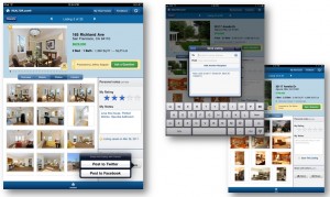 Jill directs Jack to drive into the community. As they turn a corner, a house shows up on the scout that doesn’t have a sign in the yard. They stop in front of it and compare the photos on REALTOR.com® with the house. It is the same house. They want to get more information, so she goes to the Personal Notes section and enters a few comments. She has the option of using some of the pre-populated choices on the little pop-up spinning menu but decides to make her own notes. She decides to also “Rate” the house with her own star rating. She clicks on 4 stars (out of a possible 5). She saves the listing for future reference.
The best feature – she can share it! Thank you, Facebook! She clicks the little “Share” button and then picks Facebook – she doesn’t use Twitter quite as much. She posts the house to her Facebook page to get some feedback from her friends back home. The convenient Facebook connect screen pops up, and she types her comments and sends it off.
Within minutes her friends are busy with the “Like” button and making comments. Everyone thinks she should see it! So she uses the send button and pushes it off to her agent.
A Fairy Tale Ending
 Jack and Jill drove down a hill with a moving van right behind them. They arrive at a house that their agent, Bill, sold them that they found on their iPad with the REALTOR.com® app – all on a Saturday morning.
I guess it could happen, right? We all need to believe in fairy tales, but REALTOR.com® makes them real. Or is it just a dream?
Read the original article on mayareguru.com.